

Consider incorporating these on-trend colors into your business’ look — and tips on how to do it.
We all need a bit of sunshine after a bit of a gloomy year. That’s more than a personal feeling — the professionals agree too.
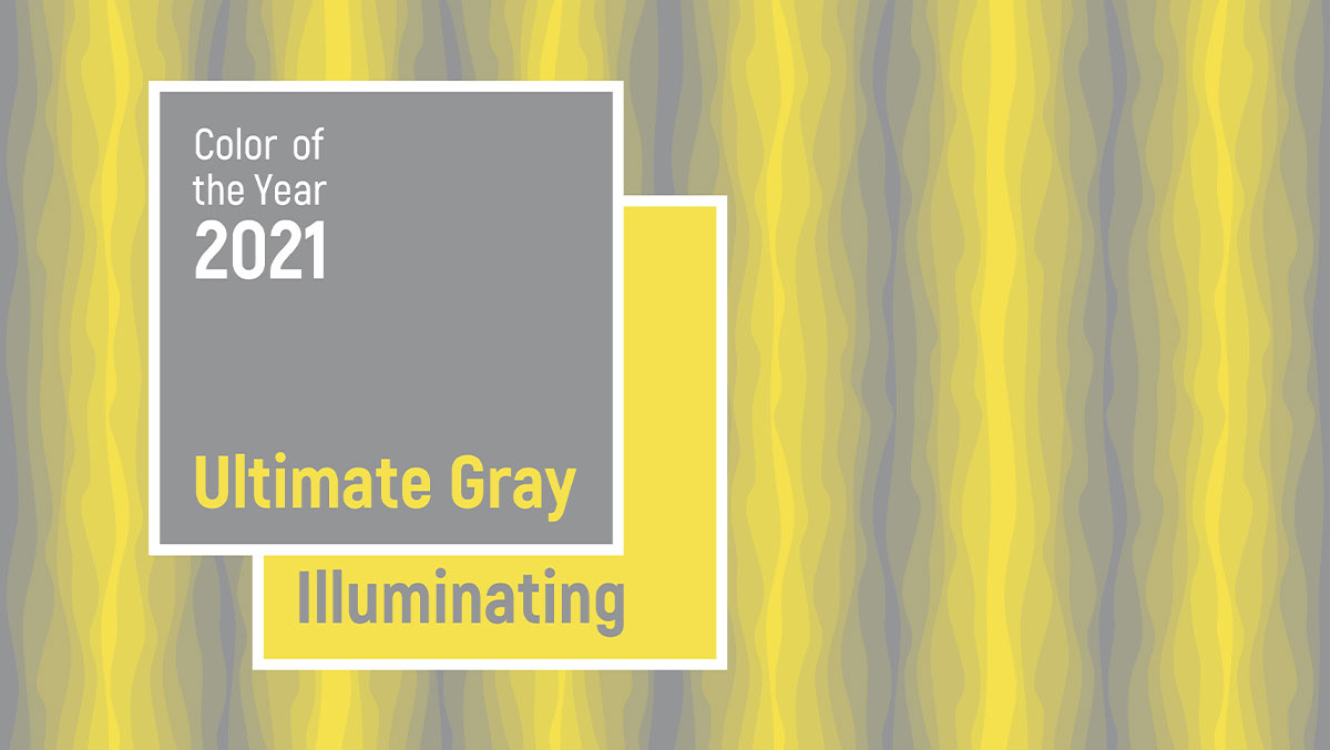
The Pantone Institute recently announced that its 2021 Colors of the Year are Ultimate Gray and the lemony-yellow Illuminating — shades chosen for their warmth and dependability. These colors reinforce 2021 business forecasts like reduced COVID cases and less social restrictions, increased spending due to pent-up consumer demand, and having our nation’s gross domestic product returning to its pre-pandemic level by the end of the year.
Pantone Color Institute Executive Director Leatrice Eiseman said: “Practical and rock solid but at the same time warming and optimistic, this is a color combination that gives us resilience and hope. We need to feel encouraged and uplifted.”
These colors are important to companies because Pantone’s color trends are a marketing force that designers and consumers gravitate toward on a visual and emotional level.
So are these colors right for your business? And, if they are, how can these colors — a ray of bright, cheerful yellow bursting out of a cool fog of gray — work best for your brand?
How do customers feel about these colors?
Color choice and audience connection is essential. Research shows the people make subconscious judgements about an environment or product within 90 seconds of initial viewing —and 62 to 90 percent of that is based on color. So it’s important to use color appropriately to both positively reflect your brand and entice people to seek you out.
Illuminating Yellow
Many brands have benefited from having a brand that’s associated with yellow. Since yellow symbolizes fast, it works for brands like Ferrari, DHL, Sprint and McDonalds. With its association with happiness and cheer, it’s ideal for places that sell items that enhance your living space like Best Buy and Ikea. And since yellow stimulates the logical side of the brain, it is well suited for academic-related brands like National Geographic, Bic or Post-It.
But Illuminating goes beyond our typical business associations with the color.
The Pantone Institute says Illuminating “heightens awareness and enhances intuition, lighting the way to the originality and resourcefulness of an open mind.” Yellow also has one of the longest light wavelengths, making it psychologically compelling.
Ultimate Gray
Odds are, you probably have a gray wall in your house or know someone who does. That’s because gray is a calming, sophisticated color. Those qualities are good for professional spaces too. People associate gray with words like stable, mature and high quality. And that’s one of the reasons the Pantone Institute chose a gray hue: “Ultimate Gray, like pebbles, is emblematic of solid and dependable elements which are everlasting and provide a firm foundation.”
While most wouldn’t want Ultimate Gray as a primary color in the company brand standards since it doesn’t evoke strong emotion like yellows, greens, reds or blues, it would be a good go-to secondary or tertiary color.
I’m ready for something new. But how should I use these colors?
These Pantone hues give customers a dose of positivity along with an undercurrent of stability — that’s something many people are seeking out. Having colors that connect with your customers is always a plus — now to put them in practice.
In signs
Illuminating Yellow
Illuminating is a powerful color. And, like the Marvel proverb says, “With great power comes great responsibility.” Unless yellow is a primary color in your brand standards, the key is to only use it to highlight must-know information. Eyes will go right to the splashes of yellow — so use that space wisely. Draw attention to specials, slogans, expertise, contact information or directions. Changes in color or bold design often pays off — to help you do it right, National Branding has a team of experts that have decades of experience in branding, sign design and fabrication.
Some words of caution: If using Illuminating as a font color, make sure there’s a dark hue behind it for contrast — think Star Wars opening credits — so people don’t have to strain to read. Also: Yellow in a digital space can be tricky — review ADA compliance guidelines and check your color palate before adding yellow to your website.
Ultimate Gray
Gray is the ultimate support color — doing whatever it can to help the cause. Perfect for a background, the gray provides a timeless color that’s good for customized signage. Ultimate Gray gives a neutral palette for the sunny accents of Illuminating or preferred primary brand color you may have.
In decor
Illuminating Yellow
Yellow is cheerful, optimistic, upbeat and warm. It’s also associated with youth, which is great since childhood is universal. However, there’s a fine line between “Sunny Days Sweepin’ the Clouds Away” and the Big Bird in the room. You need to carefully balance yellow so it doesn’t become overwhelming or evoke feelings of stress.
The trick is to find ways to bring the color throughout a space without having it take over — using HGTV designer language, yellow should be used as a “pop of color.” Depending on your business, it might be best to keep Illuminating as a background like an accent wall, colorful details in a reception area (vase, side table, art, accent pillow, planter), or using it on the walls in smaller areas that could benefit from a bright color like a dark hallway or a restroom.
Ultimate Gray
Gray is a versatile color that works well in both traditional spaces and über-modern ones. And as long as it’s accessorized with interesting eye-catching decor like lobby signs, window decals or art features, you can’t go wrong with gray; it works as a good neutral color in a variety of industries.
Grays, especially a light hued one like Ultimate Gray, can go on any wall and instantly update a space. It’s also a popular choice for flooring — wood plank flooring in gray tones continues to grow in popularity. and cabinetry, cabinets. as well as for the veins in marble-inspired countertop styles. Gray can also be brought into a room through chrome or stainless accent pieces like sculpture of lighting. Bottom line: Gray can be everything to everybody — as long as you bring in visual interest with interesting colors (hello, Illuminating) and design.
With more than 25 years of experience, National Branding has served hundreds of regional and national brands in every major industry across the United States. National Branding’s expertise includes consultation on how to best portray your brand, sign fabrication and installation of signage. National Branding doesn’t just build signs – they build brands.