Change is inevitable, even for the largest and most well-known brands like Burger King.
Their recent decision to join the flat design trend for their rebrand, with the help of creative agency Jones Knowles Ritchie, has been the talk of the business town and causing a more extensive conversation surrounding why brands are turning to this design trend in the first place.
With Burger King joining the flat design trend for its first major rebrand in 20 years, we can only assume that more companies will soon follow suit if they haven’t already.
According to an official statement from Burger King, they detailed that, “The announcement signals a commitment to digital-first expression and recent improvements to taste and food quality, through the removal of colors, flavors, and preservatives from artificial sources from menu items, as well as an ambitious pledge to environmental sustainability.”
What is flat design?
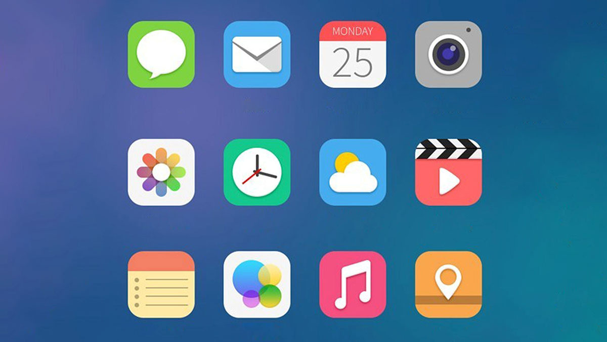
The name “flat design” comes from the fact that the design trend uses minimalistic 2-D illustrations prioritizing simplicity.
Flat designs are void of details that create a more realistic design, such as shadows, highlights, textures, beveling, or embossing.
It began to stand out as a design trend in its own right by 2013 with the release of Windows 8 and iOS 7, which transitioned to flat designs during that time.
How does Burger King incorporate flat design?
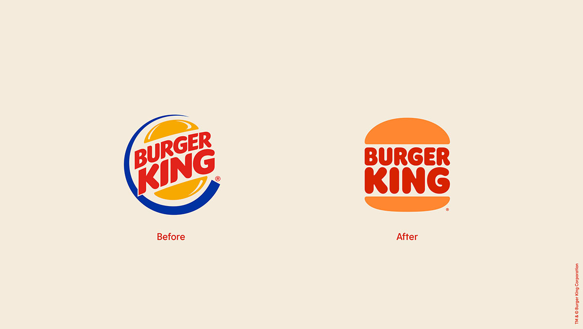
Burger Kings’ rebrand makes the transition from a edgy, colorful, and cartoon-like design debuted in 1999 to one that’s simple and more reminiscent of its original logo design from 1969 and 1994.
The streamlined and straightforward 2-D flat design logo is free of distractions with little detail while still grabbing your attention. The burger king name between two halves of a bun is all the company needs to communicate their message of being the “burger king.”
The benefits of flat design
Before we entered the digital era, 3D design was more common.
There was a time when the personal computer was becoming more mainstream, and users needed visuals that more clearly resembled the item or function of the item – such as a realistic-looking recycle bin on the computer.
Companies also were advertising via commercials, magazine ads, and billboards more, so they wanted their branding to stand out via these platforms.
Now, with us fully enthralled in the digital era, we are finding benefits in transitioning to more simplistic design options.
Translates better to mobile
Mobile phones have trumped computer usage for many, and companies have to consider how their brand looks on smaller devices like mobile phones, tablets, and now even smartwatches.
Simple flat designs are easy to resize while adapting to various screen sizes.
Simplistic visual elements also allow for websites and mobile apps to load faster and be more functional.
Burger King has heavily invested in their new mobile app, and other tech features such as self-service ordering in store, so the flat design will stand out while still matching today’s mobile design needs.
Better matches customer desires
Today, customers want to trust the brands they buy from beyond just delivering a good product. They want food with better ingredients, companies that use sustainable practices, and operate with the customer’s best interests in mind.
Companies can use design to communicate a message of quality and trust, as is done with Burger King’s rebrand.
In their effort to shed the cheap and artificial fast food reputation, they’re using a flat design logo, an updated color scheme, and font choice that feels more natural and real.
Exploring the Burger King Rebrand
The new logo choice has allowed Burger King to update its font, color profile, food packaging, menu design, social media profile, and even employee uniforms to match the company design goals.
According to Jones Knowles Ritchie, the custom color palette features warm colors reminiscent of real fresh ingredients. The custom typeface, Flame Sans, is similar to the natural and organic shape of food.
The head of design at Restaurant Brands International, which owns Burger King, states that “Design is one of the most essential tools we have for communicating who we are and what we value…” it’s for this reason that the rebrand incorporating flat design is best in communicating to customers.
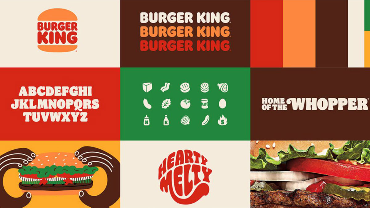
Color profile
The warm custom color palette is based on Burger King ingredients’ colors, mainly beef, lettuce, tomatoes, and fries. Hence the brown, tan, green and red colors.
They chose this color scheme purposefully as part of their overall mission to stray away from the common fast food idea of being cheap, artificial, and unhealthy.
Having blue as a primary color in their previous branding communicated the opposite of their current goal.
Now, everything from crew uniforms to packaging to social media graphics will include the colors that evoke fresh, real, and delicious food.
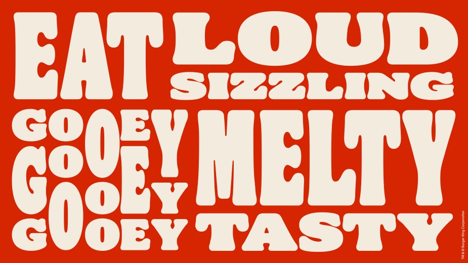
Font style
The custom made font, Flame Sans, maintains its simplicity while also standing out. Looking at the words Burger King in the logo gives you the feeling that there’s a plump juicy burger between a hamburger bun, and that’s precisely the reason behind the logo choice.
In a press release, Burger King representatives stated that the font overall is inspired by the shape of food – round, bold, and yummy.
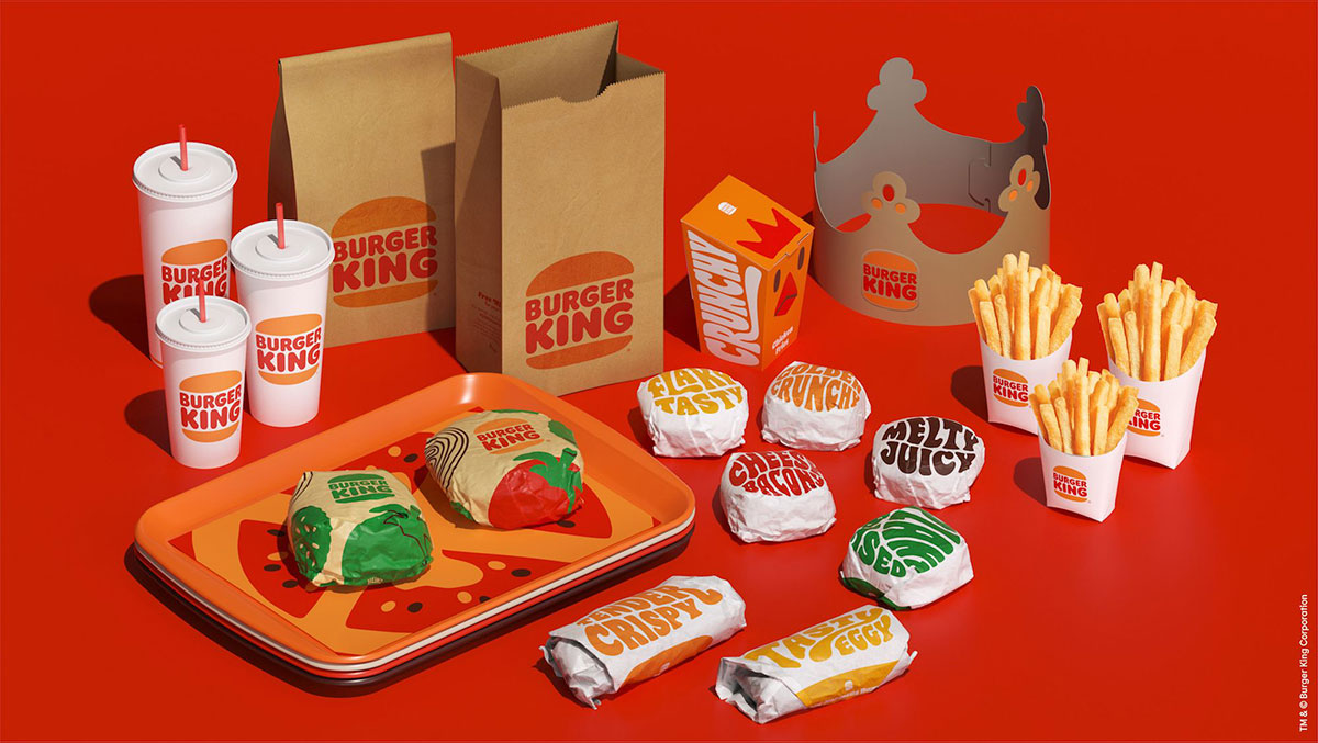
Packaging
Now when you purchase a meal from Burger King, the rebrand will be front and center.
The packaging reflects the new font, color, and logo choices.
Some of the packaging even incorporates playfully written adjectives to describe the food, such as “melty,” “crunchy,” and “juicy.”
Burger King went flat the right way
Burger King’s rebrand highlighted the right way to go flat during a redesign.
They maintained their personality, focused on the company’s overall mission, and used marketing trends to communicate the right message to their customers.


