In the heart of Nashville, Tennessee, a remarkable organization is making waves – Wellspring Learning Centers. Their Director of Marketing, Jim Yetter, and the entire team at Wellspring is on a mission to enhance the lives of children and families affected by autism and related disorders. With a thriving location in Nashville and plans for three more across the state, Wellspring is making significant strides, and they’ve partnered with National Branding to ensure their vital work gets the attention it deserves.
Wellspring Learning Centers carefully selected their name, and it carries profound meaning. “Wellspring” symbolizes an original and abundant source, reflecting the untapped potential within their young clients. It embodies the belief that every child, regardless of their challenges, possesses a wellspring of abilities waiting to be nurtured.

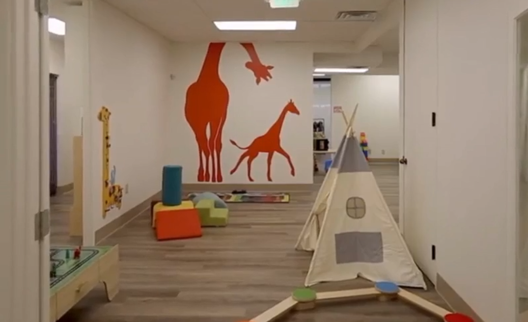
Wellspring is introducing an innovative approach to ABA therapy for children in the crucial preschool age range of 2 to 5 years. One of the most differentiating features of Wellspring Learning Centers is its open floor plan and inviting, play-based learning environment. Children are encouraged to have fun while they learn, as the Wellspring team places an emphasis on child-led ABA. In Tennessee, where ABA treatment for autism treatment is now insurance-covered, their mission is more than vital; it’s essential. They provide a supportive environment for these children to thrive and develop crucial skills.
Jim comes from an impressive 30-year track record in marketing and branding in the automotive industry. Having revived iconic brands like Dodge Car and Ram Truck, he understands the profound impact branding can have. With National Branding’s support, he’s working to establish Wellspring as a beacon of hope for families affected by autism.
Jim’s years of marketing experience taught him that branding is more than logos and names. As he puts it, “It’s about creating a cohesive identity. National Branding helped us deliver the brand identity with consistency and continuity, which in my mind is the key to strong branding. I want them handling all the design elements important to our upscale centers as custodians of the Wellspring brand.”
The partnership’s key deliverable was a brand book, a comprehensive guide encapsulating Wellspring’s essence. National Branding’s work ensures brand consistency as Wellspring expands, whether it’s channel letters, monument signs, or interior wall wraps.
Wellspring’s choice of a giraffe as their emblem symbolizes the connection between parents and children in families affected by autism. Just like the giraffe, these families stand tall and strong amidst life’s challenges.
Through their name and emblem, Wellspring Learning Centers convey their ability and determination to improve the quality of life for affected families. They’re there to guide and support every step of the way.
Wellspring and National Branding are crafting a brand that resonates with the community, one of hope and transformation. For Wellspring, National Branding isn’t just a sign company; they are a partner and the architects helping to deliver a powerful brand experience.
In the end, for Wellspring Learning Centers and Jim Yetter, branding isn’t just about aesthetics; it’s about making a meaningful difference in the lives of children and families affected by autism. With National Branding’s support, they are well on their way to turning this vision into reality, one sign at a time. National Branding, with its expertise and commitment to storytelling through branding, is instrumental in bringing this vision to life.


